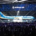
Korean Air’s rebranding features a modernized Taegeuk symbol in a deeper blue, paired with a new typeface that’s cleaner and more streamlined. The updated logo and symbol, combined with a metallic look on the aircraft livery, create a sleek, contemporary visual identity that emphasizes the airline’s innovative and…
Korean Air Takes Off with a Fresh New Look
Full Disclosure: This webpage may contain affiliate links, in which the website owner would receive a commission for purchases made. This does not affect your purchase cost.
