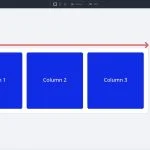
In Part 9 of our Mastering Flexbox series, we showed how Column Class works with Layout Wrapping, Gap, Justify Content, Align Items, and Display Order to create responsive multi-column layouts without reaching for CSS Grid for every pattern. Over the course of this series, you’ ve learned the core…
Part 10 Of Mastering Flexbox: Best Practices & Helpful Tips
Full Disclosure: This webpage may contain affiliate links, in which the website owner would receive a commission for purchases made. This does not affect your purchase cost.
