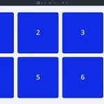
In Part 7 of our Mastering Flexbox series, we focused on building flexible button, menu, and link rows. We used Layout Direction, Justify Content, Align Items, Gap, and Module Groups to create compact, responsive horizontal groups that can adapt across breakpoints. In Part 8, we’ re focusing on one…
Part 8 Of Mastering Flexbox: Controlling Spacing With Gap (Not Margin)
Full Disclosure: This webpage may contain affiliate links, in which the website owner would receive a commission for purchases made. This does not affect your purchase cost.
